Friday, 29 April 2011
A technical hitch
Unfortunately, Jacob has been trying to try and upload our film analysis and final movie however there has been a technical difficulty as the sound does not work on our film analysis or movie. We have tried to upload it in different ways etc however it hasn't worked. We will need to find another way of uploading it however we cannot have the working videos by the deadline at 6pm today. We are hoping that the technicians will be able to help us out when we come back to college. Here is our movie without sound -

Wednesday, 6 April 2011
Film Poster Research - Jamie
We have taken various screen shots from our footage which we believe may work well for our film poster. We have tried to find shots which include a key moment in the film, so the image can give the target audience an idea of the story, but also with enough space in order to include the film title and other information.

Here is a possible shot we may use for our poster, together we have been discussing which would be best for the poster. As the film is titled 'No Fishing' we have got hold of a decorative aquarium item in which the words 'No fishing' appear. In this shot you can see we have framed it so the title is on the left, and the two characters on the right. The only problem with this shot is that the fish is slightly covering the title. This is why we took numerous shots in order to get the right one.

In this shot the fish has kindly moved out the way, so now the title 'No Fishing' is clear for the audience to see. This would be much more suitable for our final poster design.
 I like this shot for a poster as I think the composition is really nice. The bench is centralised and the character 'Scott' is sitting on one end of the bench, this signifies how alone he is as there is a gap left for someone to sit.
We have made the decision to use the fish tank shot for our final poster.
Tuesday, 5 April 2011
Group evaluation
1 - In what ways does your media product use, develop or challenge forms and conventions of real media products? - Eve and Adam.
Short Film

The last image of the nine shows their happiness to get off the train and away from the characters, therefore leaving a sense of uncertintity, this is what we were trying to achieve at the begginning of the film and hopefully the audience will agree too, that we have achieved this.
The most important part of this film was the music for me, it allowed a great amount of tension to be built up and allow the audience exciting and gripping entertainment. During our own film we attempted to do this however; in a less dramatic way, I think this worked well and successfully allowed the audience relate easily to Scott and his situation.
Looking at the other shots in the grid, I think they all worked well and came out how the group wanted them to; the angles used and tried out were successful with the influence of Mixtape, King Ponce and Strangers.
I think the variation in shots along with the music that we chose to insert, like in Strangers; the music is a crutial part of the film and it allows suspension and tense scenes to be built up. By using the track 'Somebody Like You' by Adele during the begginning and then creating our own music to have during the later events which changes as the general mood and feel of the film improves, I think this allowed the film to be much more entertaining and interesting for the audience.
Unlike our films we were researching, we decided to use a lot of fades during our film to emphasise the difference and contrast between reality and dream. I think this greatly helped us and like in King Ponce with the fade whilst they are smoking, it allows the audience to easily distinguish the difference.
As short films are one of the leaders in creative and original movies it is hard to identify similarities between our movies and the short film network. In terms of narrative, we wanted to follow films such as King Ponce and Strangers in which we are led to believe the ending will be a malicious one however it turns out to be a happy ending. This kind of technique , which breaks from stereotype, we liked the idea of and we tried to develop into our story as we wanted to make the viewer believe our main character would be lonely throughout the film but surprise them by him finding someone. The lonely love story we developed also resembled films such as signs as the narratives can be closely matched.
The font used in our poster varies as the title is already in the picture which we liked the idea of as not many other films do this and we believe it works well. The orange font used for the reviews closely matches posters such as ones for 'Juno' as they are follow the same colour scheme of orange and a smooth rounded font.
Our review followed the magazine 'little white lies' closely as it follows the layout of their film reviews. The layout of our review compared with the little white lies is very close and this is what we were trying to achieve as 'little white lies' has a nice proffesional touch to it. We're happy with our review as we think someone would enjoy reading it, aswell as looking at it- Adam
2. How effective is the combination of your main product and your ancillary task? Eve, Adam, Jacob & Jamie
After looking and reviewing the film, poster and various aspects of the film including sound and editing we decided as a group that our film was fairly successful, the sound and editing made the film much more effective and really made the coursework piece much more interesting and appealing to the target audience.
We have decided that we would like to review our film and poster in a different way, rather than writing and making in in a more essay form. As a group we sat down and talked about how we would like to present our evaluation of our piece of coursework, we came to the decision that we would like to record ourselves (as a group) doing a voice-over of our views and comments on good and bad aspects of the film we have created. We thought this would be different and fit in well with the idea of the blog and we thought it would be able to portray our true feelings in a descriptive way about the film itself.
Here is the video that we created to show our final views on our poster and how we developed our ideas. We decided this would be the best way to evaluate our poster because it gives us the freedom to discuss issues while being recorded as a group.
3. What have you learned from your audience feedback? Jacob and Jamie
 We have tried to use many different techniques to obtain audience feedback, this is so that we get a wide range of views and ideas from different people, which could potentially improve our film, poster and review. During filming we used some of our test shots and created a small video to show the basic idea and film settings and then posted this to youtube and our blog to see what people thought of the initial idea. We only got a small amount of feedback from this and used those ideas to continue filming. When the film was finished including all music and titles, we uploaded it to blogger and to youtube to get even more audience feedback, we then decided that we didn’t gain enough from these the first time so linked our film to Facebook (An online social network) and asked friends to comment on the film giving us ideas and thoughts on shots and story from the film as well as music and titles.
 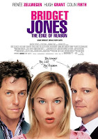 I think we learnt a lot from our audiences and used there advice well, many people said that they liked the idea of our film although said that there was a chance that it may be too much of the same style of storyline which is used in many rom-com/romantic films.
I think that we learnt from this and then used a stereotype that isn’t used often of a ‘blogger’ who is still around in the real world. What I mean by this is that many films use a stereotype of a young boy obsessed with computers and therefore he never leaves his room and sees sunlight, we tried to bring our character away from this by listening to what our audience said and giving him an outside job of gardening and showing images of him in a bright college corridor. - Jacob
Audience feedback is very important for big budget films as without it they would risk creating a film which does not reach its target audience or any audience at all. Test audiences are used in order to receive this feedback and obviously people would review parts of the film during production to make sure certain scenes, the narrative and the sounds in the film are to a good quality and entertaining. Film reviews and premieres are also key because if these are negative this has a huge effect on the amount of cinema viewings and therefore the inflow of money made from the film. With such large budgets and reputations at stake negativity has to be avoided at all costs.
 If we were ever to produce our own full length film in the future we would definatly use what we have learnt about the importance of audience feedback and make sure it is extensive. As we had limited resources, equipment, money and time we could not explore and exploit the full advantages of using audience feedback. Although the tools we have used in order to receive feedback (Facebook's online social networking service) aswell as speaking to family and friends have fit the purpose of our task.
When using test audiences film producers would have to make sure they are showing their film to a suitable audience in the first place. For example they may be producing a film targeted at stereotypical teenage female students, who (following a stereotype) may prefer to watch rom/coms and dramas, so if the company are producing an action packed, gun filled thriller, in this case the time and resources used may have gone to waste if they already have an idea on the reaction of the audience. However, this can also be very useful as their could be some very different results, and it is always important to cover all outcomes to give yourself the best chance of creating a film which will satisfy your target audience whatever the size.
- Jamie
4. How did you use new media technologies in the construction, and research, planning and evaluation stages - Eve, Adam, Jacob & Jamie
Short Film

These nine images are from a variety of films that we used as influences during our planning and research for our media film and poster. The ones that were most effective we believed was Mixtape, Strangers and King Ponce; they all appealed to us because in their own way they were very quirky and different. For example, Mixtape is a very short film and shows the audience how much can be given to them in a simple yet effective way. The variety of close ups and establishing shots allow the audience to understand the characters body language and posture in a much easier way, therefore being able to understand, relate and enjoy the short film.
Compared to that of King Ponce which is one of our longer films that we chose to look at, we really liked the way the idea of the film went against normal sterotypes of teenagers in certian ways. For example when the males burst in to the room whilst they are practicing the dance, the teacher decides to sit them down for them to watch rather then kicking them out. This is something that really appealed to us as a group because of us being teenagers ourselves, we felt we could really realte to that.
There is also a scene whilst the boys are smoking where a fade is used to emphasise the hazy and dizzy feeling the character is experiancing. The group really liked using this idea to an advantage in our own media film and have done so.
Our third chosen film that we decided to look at in depth was Strangers, a seven minute long film however; with a twist. There is no dialogue included in the film, this makes the context and story line so much more interesting and includes 'edge of seat' entertainment. We enjoyed how it was cleaverly done with a variety of angles and shots included throughtout the film. Cantered angles and close ups were greatly included and this allowed the suspence to build up and have a peak of tension which the audience enjoys. For a fairly short film, we quickly build up a posotive idea about the two gentlemen and the group who seems to be bothering them, the last shot leaves the audience wanting to know more, they swap bags as they jump of the train and this makes us wonder what is in the bags, why are they so happy to be off the train and why were they being chased by a group of men.The last image of the nine shows their happiness to get off the train and away from the characters, therefore leaving a sense of uncertintity, this is what we were trying to achieve at the begginning of the film and hopefully the audience will agree too, that we have achieved this.
The most important part of this film was the music for me, it allowed a great amount of tension to be built up and allow the audience exciting and gripping entertainment. During our own film we attempted to do this however; in a less dramatic way, I think this worked well and successfully allowed the audience relate easily to Scott and his situation.
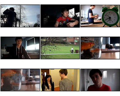
This group of images are ones taken from our own media film. It is exactly 5 minutes long which was the maximum amount of time allowed, we managed to shoot a wide range of different shots and experiment with different angles. The first image on this sheet is an example of this, along with the 5th and 8th, we experimented with these two as we wanted the audience to feel sorry for 'Scott'. Getting the idea from Mixtape to use depth of field to our advantage allowed us to come up with the idea for the shot in the fifth image.
The seventh image on the grid is an example of a fade that we used during the film, it comes at the end of the film whilst we see Laura and Scott on the sofa together. We thought it worked well and was similar to the idea used in King Ponce as it is alike to the idea of him dreaming, we thought this would work well because of Scott (now being with Laura) thinks it is like a dream come true. Looking at the other shots in the grid, I think they all worked well and came out how the group wanted them to; the angles used and tried out were successful with the influence of Mixtape, King Ponce and Strangers.
I think the variation in shots along with the music that we chose to insert, like in Strangers; the music is a crutial part of the film and it allows suspension and tense scenes to be built up. By using the track 'Somebody Like You' by Adele during the begginning and then creating our own music to have during the later events which changes as the general mood and feel of the film improves, I think this allowed the film to be much more entertaining and interesting for the audience.
Unlike our films we were researching, we decided to use a lot of fades during our film to emphasise the difference and contrast between reality and dream. I think this greatly helped us and like in King Ponce with the fade whilst they are smoking, it allows the audience to easily distinguish the difference.
As short films are one of the leaders in creative and original movies it is hard to identify similarities between our movies and the short film network. In terms of narrative, we wanted to follow films such as King Ponce and Strangers in which we are led to believe the ending will be a malicious one however it turns out to be a happy ending. This kind of technique , which breaks from stereotype, we liked the idea of and we tried to develop into our story as we wanted to make the viewer believe our main character would be lonely throughout the film but surprise them by him finding someone. The lonely love story we developed also resembled films such as signs as the narratives can be closely matched.
We thought that using a non diagetic voice over in our film would follow the trend in most short films of having limited dialogue. We used our voice overs to create this sense of loneliness as if he’s talking to himself which are used in other short films to create the same effect.
The two main characters between ‘signs’ and our film bare some similarities:
- Both characters feel alone.
- Both find love at the end
- Personalities are similar in the way that they are looking for something better with life however ‘signs’ cleverly does this without sound.
Another frequent element of short films is they usually have an unexpected twist or unexpected ending. We tried to achieve this by our main character one day coincidentally meeting the girl of his dreams whilst working in a garden for his work experience; I don’t think this was achieved as well as it could have been. This is only because we had to cut a section of our movie out due to a consistency error so the sequence seemed very rushed. This rushed sequence meant that our main character avoided the girl in a corridor but then we see the next shot is her bringing him a drink. If we were to make another movie we would make sure the shots were more carefully thought out and was spread across enough scenes to ensure it makes sense. It was easy to become sidetracked as we already knew the story however it may be hard for a viewer to pick up on the story we intended them to see.
In my film analysis I found that I referred to short films in their colour and lighting. For example in 'black hole' i noted that the colour and lighting were dull and dreary to create the effect of a monotonous office. I also noted in my analysis of 'goodbye to the normals' that "the colour and lighting seem quite everyday in this shortfilm and I think they wanted to have it like that so we do get a sense of normality. It might not be necessary to different lighting in our film and perhaps we can keep it normal to allow the audience to concentrate more on story and character" This is the kind of lighting we wanted to use in our film and I think we achieved this as we didn't see the need to make lighting too eccentric or too dull however we used extra lighting in the happy ending to create a more happy feeling. Here is a link to my film analysis http://advancedportfolio1164.blogspot.com/2011/01/short-film-research-adam.html
Ancillary Task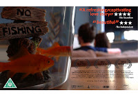 We thought our poster follo.wed some conventions of current posters such as the colour scheme. Our poster follows the theme of orange and black. The reviews and fish are orange and the title, studio block, awards, sponsors and website are in black. Following this sort of colour scheme helps to create a poster that is easy on the eye and is a popular theme within posters. The 'inglorious basterds' poster to the left shows this same colour matching theme as the red colour of the flag is seen as blood, in the title and the year of release. The background and knife match the white of the title, this is something we tried to follow to make our poster look more professional.
Ancillary Task
 We thought our poster follo.wed some conventions of current posters such as the colour scheme. Our poster follows the theme of orange and black. The reviews and fish are orange and the title, studio block, awards, sponsors and website are in black. Following this sort of colour scheme helps to create a poster that is easy on the eye and is a popular theme within posters. The 'inglorious basterds' poster to the left shows this same colour matching theme as the red colour of the flag is seen as blood, in the title and the year of release. The background and knife match the white of the title, this is something we tried to follow to make our poster look more professional.
 | |
Our review followed the magazine 'little white lies' closely as it follows the layout of their film reviews. The layout of our review compared with the little white lies is very close and this is what we were trying to achieve as 'little white lies' has a nice proffesional touch to it. We're happy with our review as we think someone would enjoy reading it, aswell as looking at it- Adam
2. How effective is the combination of your main product and your ancillary task? Eve, Adam, Jacob & Jamie
After looking and reviewing the film, poster and various aspects of the film including sound and editing we decided as a group that our film was fairly successful, the sound and editing made the film much more effective and really made the coursework piece much more interesting and appealing to the target audience.
We have decided that we would like to review our film and poster in a different way, rather than writing and making in in a more essay form. As a group we sat down and talked about how we would like to present our evaluation of our piece of coursework, we came to the decision that we would like to record ourselves (as a group) doing a voice-over of our views and comments on good and bad aspects of the film we have created. We thought this would be different and fit in well with the idea of the blog and we thought it would be able to portray our true feelings in a descriptive way about the film itself.
Here is the video that we created to show our final views on our poster and how we developed our ideas. We decided this would be the best way to evaluate our poster because it gives us the freedom to discuss issues while being recorded as a group.
3. What have you learned from your audience feedback? Jacob and Jamie
 We have tried to use many different techniques to obtain audience feedback, this is so that we get a wide range of views and ideas from different people, which could potentially improve our film, poster and review. During filming we used some of our test shots and created a small video to show the basic idea and film settings and then posted this to youtube and our blog to see what people thought of the initial idea. We only got a small amount of feedback from this and used those ideas to continue filming. When the film was finished including all music and titles, we uploaded it to blogger and to youtube to get even more audience feedback, we then decided that we didn’t gain enough from these the first time so linked our film to Facebook (An online social network) and asked friends to comment on the film giving us ideas and thoughts on shots and story from the film as well as music and titles.
 Here is a link to our audience feedback work on Facebook: http://advancedportfolio1164.blogspot.com/2011/03/facebook-raw-footage-feedback-jacob.html
 I think we learnt a lot from our audiences and used there advice well, many people said that they liked the idea of our film although said that there was a chance that it may be too much of the same style of storyline which is used in many rom-com/romantic films.
 I think that we learnt from this and then used a stereotype that isn’t used often of a ‘blogger’ who is still around in the real world. What I mean by this is that many films use a stereotype of a young boy obsessed with computers and therefore he never leaves his room and sees sunlight, we tried to bring our character away from this by listening to what our audience said and giving him an outside job of gardening and showing images of him in a bright college corridor. - Jacob
Audience feedback is very important for big budget films as without it they would risk creating a film which does not reach its target audience or any audience at all. Test audiences are used in order to receive this feedback and obviously people would review parts of the film during production to make sure certain scenes, the narrative and the sounds in the film are to a good quality and entertaining. Film reviews and premieres are also key because if these are negative this has a huge effect on the amount of cinema viewings and therefore the inflow of money made from the film. With such large budgets and reputations at stake negativity has to be avoided at all costs.
 If we were ever to produce our own full length film in the future we would definatly use what we have learnt about the importance of audience feedback and make sure it is extensive. As we had limited resources, equipment, money and time we could not explore and exploit the full advantages of using audience feedback. Although the tools we have used in order to receive feedback (Facebook's online social networking service) aswell as speaking to family and friends have fit the purpose of our task.
 When using test audiences film producers would have to make sure they are showing their film to a suitable audience in the first place. For example they may be producing a film targeted at stereotypical teenage female students, who (following a stereotype) may prefer to watch rom/coms and dramas, so if the company are producing an action packed, gun filled thriller, in this case the time and resources used may have gone to waste if they already have an idea on the reaction of the audience. However, this can also be very useful as their could be some very different results, and it is always important to cover all outcomes to give yourself the best chance of creating a film which will satisfy your target audience whatever the size.
- Jamie
4. How did you use new media technologies in the construction, and research, planning and evaluation stages - Eve, Adam, Jacob & Jamie
Evaluation on Prezi
Sunday, 3 April 2011

Friday, 1 April 2011
Review is finished- Adam and Eve
Here is our original template before the review was written. We decided to split the roles up between Adam and I because this allowed us to use our strength's to our advantage, Adam was able to create the review template, insert the correct font which we were trying to match the text type, format and layout from Little White Lies review of ''The Fighter''. This was a great example that allowed us to produce a poster review that the whole group really liked the outcome of.
I decided to take on the role of writing the review itself, I found it difficult in some parts as because the film was only five minutes long there was little I could write about however; after reading several other reviews from Little White Lies I managed to understand the lexical content and the way the text was layed out in relation to the film.

This is our final design for the review, we have finished the text and Adam has completed the finishing touches to the overall view of the poster. We both decided that we are very pleased with the outcome of the review, from the image to the text that has been produced; it gives a good feel of what the film is about and allows the audience to have a brief in-look to the films content.
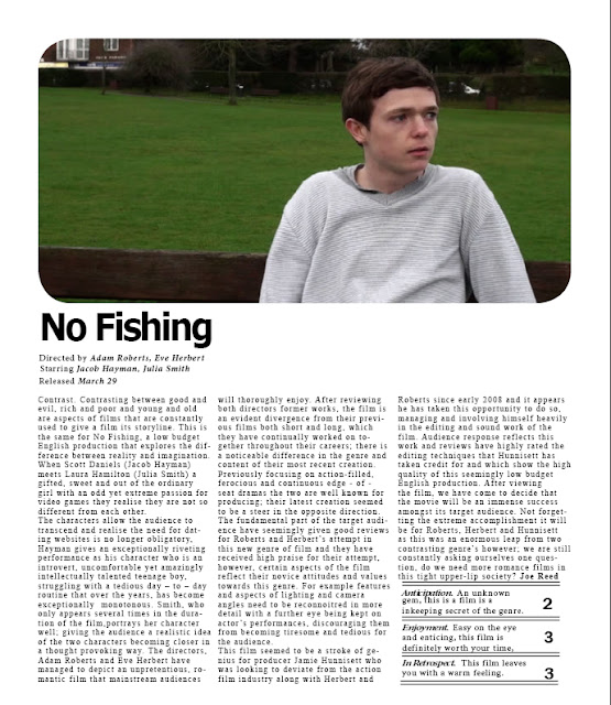
I have decided to include the text in this blog as it is hard to read from the print screened image that has been taken of the final piece.
I decided to take on the role of writing the review itself, I found it difficult in some parts as because the film was only five minutes long there was little I could write about however; after reading several other reviews from Little White Lies I managed to understand the lexical content and the way the text was layed out in relation to the film.

This is our final design for the review, we have finished the text and Adam has completed the finishing touches to the overall view of the poster. We both decided that we are very pleased with the outcome of the review, from the image to the text that has been produced; it gives a good feel of what the film is about and allows the audience to have a brief in-look to the films content.

I have decided to include the text in this blog as it is hard to read from the print screened image that has been taken of the final piece.
Thursday, 31 March 2011
Film - Eve
As you can see below we have now finished our sound and editing of the footage, it has been a very long process that took the group longer than we had preferred due to various events that caused us to take longer completing the editing and completing the film.
Now that the film is on the blog, we are hoping to get feedback. Also we will be loading the film onto Facebook therefore; we can get more feedback from our target audience who will give reliable and fair comments about various aspects and quality of the film. We will be putting these comments on the blog so our teachers and others can view them, we would like pro's and con's to the film as we as a group have noticed many of both ourselves and would happily accept constructive criticism as we think this will all help us see where we could of improved, it allows us to have evidence which we can use whilst doing the feedback/final analysis of the film and this will also help us in our exam
The group is now working on the poster and review, Jamie and Jacob have started the poster and the ideas are looking very promising and we will be working on them tomorrow through lunch and during the afternoon. Adam and I have been working on the review which we have both found difficult to start however; after focusing on it today for an hour during the lesson we have started a good piece that we will finish tomorrow and to a high standard.
Now that the film is on the blog, we are hoping to get feedback. Also we will be loading the film onto Facebook therefore; we can get more feedback from our target audience who will give reliable and fair comments about various aspects and quality of the film. We will be putting these comments on the blog so our teachers and others can view them, we would like pro's and con's to the film as we as a group have noticed many of both ourselves and would happily accept constructive criticism as we think this will all help us see where we could of improved, it allows us to have evidence which we can use whilst doing the feedback/final analysis of the film and this will also help us in our exam
The group is now working on the poster and review, Jamie and Jacob have started the poster and the ideas are looking very promising and we will be working on them tomorrow through lunch and during the afternoon. Adam and I have been working on the review which we have both found difficult to start however; after focusing on it today for an hour during the lesson we have started a good piece that we will finish tomorrow and to a high standard.
Thursday, 24 March 2011
Titles - Eve
For our short film, we have decided we will be inputting a title sequence with everyone who had an input during the making/editing and input during the making of ''No Fishing''
These are the titles which we have decided on as a group and will be putting them at the beginning of the film -
- Director - Adam Roberts & Eve Herbert
- Producer - Jamie Hunnisett
- Lighting - Jacob Hayman, Jamie Hunnisett, Adam Roberts & Eve Herbert
- Sound/Music - Adam Roberts
- Editing - Jacob Hayman, Jamie Hunnisett, Adam Roberts & Eve Herbert
- Cast - Julia Smith & Jacob Hayman
- Photography - Eve Herbert
Tuesday, 22 March 2011
Facebook - Raw footage feedback - Jacob

This is the link to the web page.
0 Media A2
Discussions of use of technology - Jacob
 |

When initial think about our shot types and how we were going to film we anticipated having to use this reflectors to create more light in the rooms, as it happened we didn't think we would need these so therefore didn't take them with us to film.

We used this type of LED light to help give the impression of television and computer light, the way in which you can change the light intensity on the side of the light meant it was really easy to control and helped us to get the right light effect for the Tv screen shots. When undergoing the lighting this time, we spent more time thinking about light and how it would effect our shots.
Message to "Fat Segal" Concerning Music

I sent this email to ask if we were allowed to use a piece of music which was copyrighted to this artist.
After considering to use this music when then decided against it and sought after other music, we looked through a few sites to see if there was any music we could sample and then proceed to compose our own music from it. After looking for a while we found an instrumental piece titled "someone like you" and then edited this to fit perfectly in with our film. Also we had to use GarageBand to create our own piece of music that went along with our film, Adam took the lead role in this due to his excising skills with this software. We decided that we would make the music around our film rather than trying to create a piece and then putting it in the film afterwards. It was better for us to compose the music over the film so that we could make every change exactly where we felt was necessary for the sound to vary in volume. It was decided that we should start the film as a quiet and almost depressed piece of music and then as the story evolves we used slightly more upbeat music and then finished on a faster and louder upbeat mood. Our final music can be heard on our final film which helps appreciate how it goes with the footage.
First Draft of Poster - Jacob

Discussion on Technology (Software) - Jamie
When editing we have decided to use a program called 'Final Cut'. The software is installed on the Macs in the editing suite and is a semi professional program which is relatively easy to use. We chose 'Final Cut' over 'iMovie' which is Apple's own editing software because it is more advanced and gives us a wider scope with editing techniques and creativity.
We used the blade tool to cut out sections and trim sections of different clips, we have also added transitions which are already built into 'Final Cut' this makes it easier for us to have access to using transitions. Also 'Final Cut' allows us to easily add in recordings, for example we have used a voice over in our film, therefore this was very helpful.
 You can see even from the difference in the two screen shots how basic iMovie is (on the right) compared to Final Cut (on the left)
Filming Update - Jamie
After editing our original footage we have found a few shots which we wish to do again and also we want to add some new shots into the film. Therefore we have organised to film again tonight in order to get these shots. Once we have these shots we can continue editing and finish before the deadline.
Thursday, 17 March 2011
Poster ideas - Eve
As a group we have been thinking about ideas we have had for poster ideas, after deciding individually on ideas we have had and drawing sketches then scanning them into computers and putting them on the blog. This allowed us to get feedback off of our teachers and listen to their opinions on what poster idea we could in fact use.
During our filming process that we have been doing, we took a variety of stills whilst thinking of images we could use for our posters, there are some examples below. I have also decided to take screen shots from our footage that we have loaded onto Final Cut Pro where we are editing and used them as examples of the types of images we are hoping to use for our poster idea. We wanted to have a variety of different images included in the blog so when we came round to completing our edited footage we can work on the poster idea and we will have many images, stills and screen shots for ideas of photography that we could use for our poster idea.

 These images are print screen shots that I have taken from actual footage that we have used during our film. I have decied to use and input this with our poster idea work because some of the shots were very successful and I think they may work really well with the poster idea.
 I thought the image to the left was very successful as it showed the body language and facial expression on Scott's face which I thought work very well.
I really liked this image, I think it would make an interesting, different and very visually appealing poster for our target audience especailly with the bright colouring of the clock and contrasting blue of Scott's t-shirt in the background.
As you can see from the same image to the right, I have edited it so you simply have the clock and Scott's t-shirt in colour. This is not too obvious to an audience however, it may make the image more appealing to the audience and capture their attention.

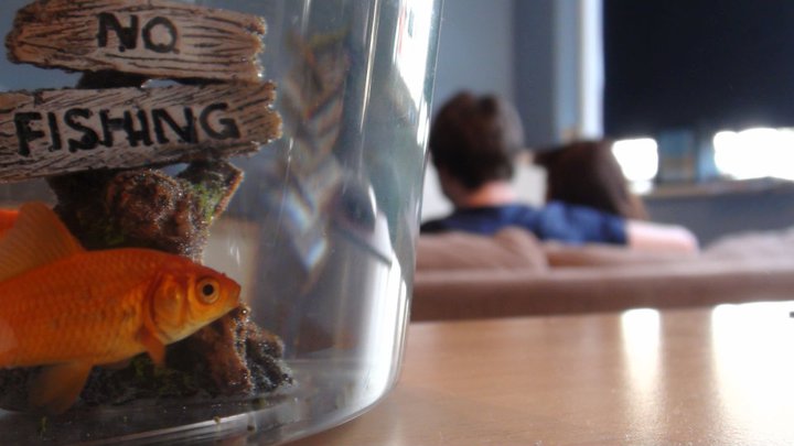
 These three images are ones that we took whilst coming to the end of our filming, they were just after we had filmed the last scene and the position of the fish bowl in relationship to the two characters really appealed to me, therefore; I decided to take a picture and thought we might be able to use it as a poster idea and maybe use it for our final poster. I have made the image below bigger than the others as this is one we as a group, all really liked. After looking at the image and discussing it with our teachers wedecided that we would use the 'No Fishing' sign in the fish bowl as the title of our film. This would allow us to work closely with the image and work around successfully with the title. The text type on the sign is perfect and what we would of wanted to achieve, we are hoping to find a type similar to this so we can add various sections to the poster and therefore make it more appealing to the audience.
Use of technologies -Camera - Adam
 |
| The HD camera we used. |
 | |
| Microphone (Top) and microphone attachment |
Filming update - Eve
During the last few weeks we have collected the last few rushes/clips that we needed to complete the final coursework piece for this year. Some of our shots have worked out really well and as a group I think we have all worked really well together to produce the piece of coursework.
We are currently in the editing suite looking through our footage, clipping and editing out bits that we did not think worked so well. The process is slower than we would like however; we hope to get the editing complete soon and to a good standard.
We are trying to split into groups to get various aspects of the work done for example, Jacob and Adam are focusing on editing, Jamie is looking at the poster ideas and I am looking at the blog to see where positive changes that need to be made that will enable us to up our grades for the coursework.
We have all been looking into poster ideas and with Jamie's help we have been looking at various different still images and different shots that we have used during the filming that we captured and working out how we can use them effectively and use them to create a successful poster that will appeal to our target audience.
We are currently in the editing suite looking through our footage, clipping and editing out bits that we did not think worked so well. The process is slower than we would like however; we hope to get the editing complete soon and to a good standard.
We are trying to split into groups to get various aspects of the work done for example, Jacob and Adam are focusing on editing, Jamie is looking at the poster ideas and I am looking at the blog to see where positive changes that need to be made that will enable us to up our grades for the coursework.
We have all been looking into poster ideas and with Jamie's help we have been looking at various different still images and different shots that we have used during the filming that we captured and working out how we can use them effectively and use them to create a successful poster that will appeal to our target audience.
Thursday, 10 March 2011
Inital Poster Design - Jamie
 This is my poster idea. The character is sitting on the bench on his own which I have obviously done to give the audience an idea of the narrative of the story because he is obviously alone in the film. I have tried to aim it at our target audience which is around the 14 to 40 age range. The poster, like our film, does not feature any violent or graphic images.
 Tuesday, 8 March 2011
Film Poster Analysis - Jamie

From this poster we can see that the target audience is teenagers, this is because bright colours and youthful font has been used. Also the two characters we can see are portrayed as teenagers.
We can get an idea of the narrative behind the film from the fact that the young girl's 'bump' has been made obvious to us by using a stripey t-shirt that clashes with the stripey background. This is to show the audience that the film involves a girl going through teen pregnancy. The boy standing close to her scratching his head tells us he is most likely the father of the child, and that he doesn't really have an idea on what is going on. The two characters are seen as typical teenagers, one dressed in casual clothes, her body language makes her look like shes not too bothered about being pregnant and the situation shes in. The boy is dressed in sports gear, but he looks uncomfortable in them, again this adds to how he may feel like a fish out of water with the whole situation he has got himself into (Teen father)
He also looks as if he doesn't or hasn't had much control over what has happened/happening, whereas she looks like shes in the drivers seat and looks comfortable being there.

This poster is for the film 'Brighton Rock', one of the first things you notice are the three characters in the foreground. The man in the centre is very prominent, and the fact that he's in the centre shows that he may play a key role in the film. His facial expression is very serious, almost scowling at the camera, this is obviously to show the dark nature of the film. He is also wearing a long black coat, again this is dark suggesting evil, however it also has links to detective films, wear many characters stereotypically wore long coats.
The woman to the left of him in red has a very worried facial expression, her stance isn't very powerful so this shows vulnerability, as for the woman on the right who his staring at the woman in red, she looks a bit more in control. She is wearing the lightest coloured clothing out of the three, maybe suggesting innocence.
The background and setting to the poster is very dark aswell, continuing with the ideas that the film genre could be a thriller. From the skies we can see what looks like a storm brewing, this could give us an idea of what the film is about, something has been brewing and there will be a big climax at the end.
The text and layout is very formal, this allows us to make the judgement that the audience the film is being targeted at is an older audience. There is a rating certificate of a 15 on the poster.
Also the film poster is canted slightly, this could suggest instability between the characters.

On the right is a film poster for 'The Happening'.
The first thing I notice about this poster is how dark it is, the colours are very limited, dominantly in dark blue, this suggests an evil film, or a scary film. The genre is most likely to be a thriller, this suggestion is supported by the fact that the three characters are clutching onto each other and have worried facial expressions.
The buildings in the background have been warped, this is to show that maybe everything is changing or moving, or there is some kind of supernatural element to the film. The city the two characters are sitting in looks empty, makes the empathis on the three characters. The characters are all wearing normal casual clothes, this suggests they were taken by surprise.
The target audience for this film I think would be an older audience, due to the nature of the poster and the fact that it is possibly a thriller.
The text on the poster is very bold and formal, it only has the title, the director, a tag line and the writers block. This is probably done to focus the viewer of the poster on what is happening, and to give them an idea of the story.

This film poster is for the 2007 British film Control. We can see from the poster that the setting is very British, we can see the usual concrete block of flats which are seen all over some of Britain's major towns and city's, and then a slightly more traditional home in the foreground. This shows a contrast between the two, and could be trying to get across some sort of story line to do with conflict. The young man in the foreground is wearing a jacket, the jacket looks practical and not really featuring a brand of any kind. This suggests the young man doesn't really care about the way he looks to other people. He also has a cigarette hanging out of his mouth, again suggests he doesn't care about himself or his health. His facial expression is very dull, hes just looking past the camera, maybe looking at something or someone in particular.
The title is quite large, the font is very basic and it is in a dull grey colour, given as the title of the film is 'control' the formal text implies some sort of control, or restriction, no extravagant colours or fonts have been used.
I don't think the poster gives anything away about the type of genre, but I think it would come under a drama.
The poster does not show any names of any actors, therefore they are not using actors names to attract people to the film, most likely due to it being a low budget British film, and the majority of the actors would have been unknown.

This film poster is for the 2007 British film Control. We can see from the poster that the setting is very British, we can see the usual concrete block of flats which are seen all over some of Britain's major towns and city's, and then a slightly more traditional home in the foreground. This shows a contrast between the two, and could be trying to get across some sort of story line to do with conflict. The young man in the foreground is wearing a jacket, the jacket looks practical and not really featuring a brand of any kind. This suggests the young man doesn't really care about the way he looks to other people. He also has a cigarette hanging out of his mouth, again suggests he doesn't care about himself or his health. His facial expression is very dull, hes just looking past the camera, maybe looking at something or someone in particular.
The title is quite large, the font is very basic and it is in a dull grey colour, given as the title of the film is 'control' the formal text implies some sort of control, or restriction, no extravagant colours or fonts have been used.
I don't think the poster gives anything away about the type of genre, but I think it would come under a drama.
The poster does not show any names of any actors, therefore they are not using actors names to attract people to the film, most likely due to it being a low budget British film, and the majority of the actors would have been unknown.
Subscribe to:
Posts (Atom)