As a group we have been thinking about ideas we have had for poster ideas, after deciding individually on ideas we have had and drawing sketches then scanning them into computers and putting them on the blog. This allowed us to get feedback off of our teachers and listen to their opinions on what poster idea we could in fact use.
During our filming process that we have been doing, we took a variety of stills whilst thinking of images we could use for our posters, there are some examples below. I have also decided to take screen shots from our footage that we have loaded onto Final Cut Pro where we are editing and used them as examples of the types of images we are hoping to use for our poster idea. We wanted to have a variety of different images included in the blog so when we came round to completing our edited footage we can work on the poster idea and we will have many images, stills and screen shots for ideas of photography that we could use for our poster idea.

 These images are print screen shots that I have taken from actual footage that we have used during our film. I have decied to use and input this with our poster idea work because some of the shots were very successful and I think they may work really well with the poster idea.
 I thought the image to the left was very successful as it showed the body language and facial expression on Scott's face which I thought work very well.
I really liked this image, I think it would make an interesting, different and very visually appealing poster for our target audience especailly with the bright colouring of the clock and contrasting blue of Scott's t-shirt in the background.
As you can see from the same image to the right, I have edited it so you simply have the clock and Scott's t-shirt in colour. This is not too obvious to an audience however, it may make the image more appealing to the audience and capture their attention.

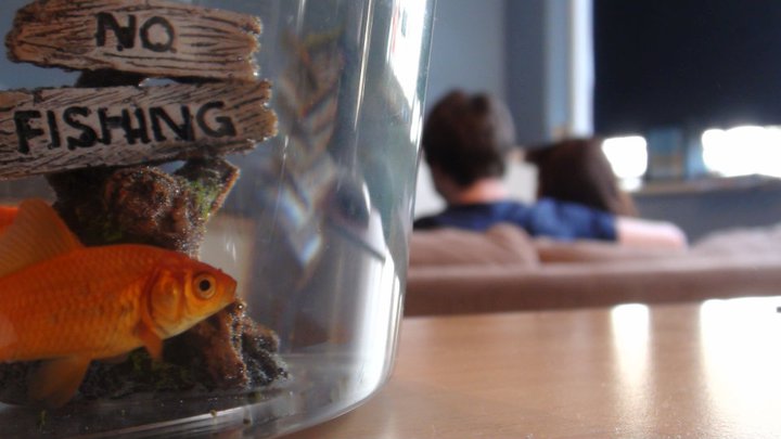
 These three images are ones that we took whilst coming to the end of our filming, they were just after we had filmed the last scene and the position of the fish bowl in relationship to the two characters really appealed to me, therefore; I decided to take a picture and thought we might be able to use it as a poster idea and maybe use it for our final poster. I have made the image below bigger than the others as this is one we as a group, all really liked. After looking at the image and discussing it with our teachers wedecided that we would use the 'No Fishing' sign in the fish bowl as the title of our film. This would allow us to work closely with the image and work around successfully with the title. The text type on the sign is perfect and what we would of wanted to achieve, we are hoping to find a type similar to this so we can add various sections to the poster and therefore make it more appealing to the audience.
Good effort Eve can you check the brief booklet and make sure that the tasks for the 18th are completed, new technologies used you only have camera at the moment, eg what did Final Cut give you over iMovie? I would like to see images and links to promotial material for other films have a look at Submarine (new British film)Whats happening with the poster? I want to see a rough cut on here so you can get some audience feedback
ReplyDelete