As you can see below we have now finished our sound and editing of the footage, it has been a very long process that took the group longer than we had preferred due to various events that caused us to take longer completing the editing and completing the film.
Now that the film is on the blog, we are hoping to get feedback. Also we will be loading the film onto Facebook therefore; we can get more feedback from our target audience who will give reliable and fair comments about various aspects and quality of the film. We will be putting these comments on the blog so our teachers and others can view them, we would like pro's and con's to the film as we as a group have noticed many of both ourselves and would happily accept constructive criticism as we think this will all help us see where we could of improved, it allows us to have evidence which we can use whilst doing the feedback/final analysis of the film and this will also help us in our exam
The group is now working on the poster and review, Jamie and Jacob have started the poster and the ideas are looking very promising and we will be working on them tomorrow through lunch and during the afternoon. Adam and I have been working on the review which we have both found difficult to start however; after focusing on it today for an hour during the lesson we have started a good piece that we will finish tomorrow and to a high standard.
Thursday, 31 March 2011
Thursday, 24 March 2011
Titles - Eve
For our short film, we have decided we will be inputting a title sequence with everyone who had an input during the making/editing and input during the making of ''No Fishing''
These are the titles which we have decided on as a group and will be putting them at the beginning of the film -
- Director - Adam Roberts & Eve Herbert
- Producer - Jamie Hunnisett
- Lighting - Jacob Hayman, Jamie Hunnisett, Adam Roberts & Eve Herbert
- Sound/Music - Adam Roberts
- Editing - Jacob Hayman, Jamie Hunnisett, Adam Roberts & Eve Herbert
- Cast - Julia Smith & Jacob Hayman
- Photography - Eve Herbert
Tuesday, 22 March 2011
Facebook - Raw footage feedback - Jacob

This is the link to the web page.
0 Media A2
Discussions of use of technology - Jacob
 |

When initial think about our shot types and how we were going to film we anticipated having to use this reflectors to create more light in the rooms, as it happened we didn't think we would need these so therefore didn't take them with us to film.

We used this type of LED light to help give the impression of television and computer light, the way in which you can change the light intensity on the side of the light meant it was really easy to control and helped us to get the right light effect for the Tv screen shots. When undergoing the lighting this time, we spent more time thinking about light and how it would effect our shots.
Message to "Fat Segal" Concerning Music

I sent this email to ask if we were allowed to use a piece of music which was copyrighted to this artist.
After considering to use this music when then decided against it and sought after other music, we looked through a few sites to see if there was any music we could sample and then proceed to compose our own music from it. After looking for a while we found an instrumental piece titled "someone like you" and then edited this to fit perfectly in with our film. Also we had to use GarageBand to create our own piece of music that went along with our film, Adam took the lead role in this due to his excising skills with this software. We decided that we would make the music around our film rather than trying to create a piece and then putting it in the film afterwards. It was better for us to compose the music over the film so that we could make every change exactly where we felt was necessary for the sound to vary in volume. It was decided that we should start the film as a quiet and almost depressed piece of music and then as the story evolves we used slightly more upbeat music and then finished on a faster and louder upbeat mood. Our final music can be heard on our final film which helps appreciate how it goes with the footage.
First Draft of Poster - Jacob

Discussion on Technology (Software) - Jamie
When editing we have decided to use a program called 'Final Cut'. The software is installed on the Macs in the editing suite and is a semi professional program which is relatively easy to use. We chose 'Final Cut' over 'iMovie' which is Apple's own editing software because it is more advanced and gives us a wider scope with editing techniques and creativity.
We used the blade tool to cut out sections and trim sections of different clips, we have also added transitions which are already built into 'Final Cut' this makes it easier for us to have access to using transitions. Also 'Final Cut' allows us to easily add in recordings, for example we have used a voice over in our film, therefore this was very helpful.
 You can see even from the difference in the two screen shots how basic iMovie is (on the right) compared to Final Cut (on the left)
Filming Update - Jamie
After editing our original footage we have found a few shots which we wish to do again and also we want to add some new shots into the film. Therefore we have organised to film again tonight in order to get these shots. Once we have these shots we can continue editing and finish before the deadline.
Thursday, 17 March 2011
Poster ideas - Eve
As a group we have been thinking about ideas we have had for poster ideas, after deciding individually on ideas we have had and drawing sketches then scanning them into computers and putting them on the blog. This allowed us to get feedback off of our teachers and listen to their opinions on what poster idea we could in fact use.
During our filming process that we have been doing, we took a variety of stills whilst thinking of images we could use for our posters, there are some examples below. I have also decided to take screen shots from our footage that we have loaded onto Final Cut Pro where we are editing and used them as examples of the types of images we are hoping to use for our poster idea. We wanted to have a variety of different images included in the blog so when we came round to completing our edited footage we can work on the poster idea and we will have many images, stills and screen shots for ideas of photography that we could use for our poster idea.

 These images are print screen shots that I have taken from actual footage that we have used during our film. I have decied to use and input this with our poster idea work because some of the shots were very successful and I think they may work really well with the poster idea.
 I thought the image to the left was very successful as it showed the body language and facial expression on Scott's face which I thought work very well.
I really liked this image, I think it would make an interesting, different and very visually appealing poster for our target audience especailly with the bright colouring of the clock and contrasting blue of Scott's t-shirt in the background.
As you can see from the same image to the right, I have edited it so you simply have the clock and Scott's t-shirt in colour. This is not too obvious to an audience however, it may make the image more appealing to the audience and capture their attention.

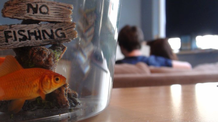
 These three images are ones that we took whilst coming to the end of our filming, they were just after we had filmed the last scene and the position of the fish bowl in relationship to the two characters really appealed to me, therefore; I decided to take a picture and thought we might be able to use it as a poster idea and maybe use it for our final poster. I have made the image below bigger than the others as this is one we as a group, all really liked. After looking at the image and discussing it with our teachers wedecided that we would use the 'No Fishing' sign in the fish bowl as the title of our film. This would allow us to work closely with the image and work around successfully with the title. The text type on the sign is perfect and what we would of wanted to achieve, we are hoping to find a type similar to this so we can add various sections to the poster and therefore make it more appealing to the audience.
Use of technologies -Camera - Adam
 |
| The HD camera we used. |
 | |
| Microphone (Top) and microphone attachment |
Filming update - Eve
During the last few weeks we have collected the last few rushes/clips that we needed to complete the final coursework piece for this year. Some of our shots have worked out really well and as a group I think we have all worked really well together to produce the piece of coursework.
We are currently in the editing suite looking through our footage, clipping and editing out bits that we did not think worked so well. The process is slower than we would like however; we hope to get the editing complete soon and to a good standard.
We are trying to split into groups to get various aspects of the work done for example, Jacob and Adam are focusing on editing, Jamie is looking at the poster ideas and I am looking at the blog to see where positive changes that need to be made that will enable us to up our grades for the coursework.
We have all been looking into poster ideas and with Jamie's help we have been looking at various different still images and different shots that we have used during the filming that we captured and working out how we can use them effectively and use them to create a successful poster that will appeal to our target audience.
Thursday, 10 March 2011
Inital Poster Design - Jamie
 This is my poster idea. The character is sitting on the bench on his own which I have obviously done to give the audience an idea of the narrative of the story because he is obviously alone in the film. I have tried to aim it at our target audience which is around the 14 to 40 age range. The poster, like our film, does not feature any violent or graphic images.
 Tuesday, 8 March 2011
Film Poster Analysis - Jamie

From this poster we can see that the target audience is teenagers, this is because bright colours and youthful font has been used. Also the two characters we can see are portrayed as teenagers.
We can get an idea of the narrative behind the film from the fact that the young girl's 'bump' has been made obvious to us by using a stripey t-shirt that clashes with the stripey background. This is to show the audience that the film involves a girl going through teen pregnancy. The boy standing close to her scratching his head tells us he is most likely the father of the child, and that he doesn't really have an idea on what is going on. The two characters are seen as typical teenagers, one dressed in casual clothes, her body language makes her look like shes not too bothered about being pregnant and the situation shes in. The boy is dressed in sports gear, but he looks uncomfortable in them, again this adds to how he may feel like a fish out of water with the whole situation he has got himself into (Teen father)
He also looks as if he doesn't or hasn't had much control over what has happened/happening, whereas she looks like shes in the drivers seat and looks comfortable being there.

This poster is for the film 'Brighton Rock', one of the first things you notice are the three characters in the foreground. The man in the centre is very prominent, and the fact that he's in the centre shows that he may play a key role in the film. His facial expression is very serious, almost scowling at the camera, this is obviously to show the dark nature of the film. He is also wearing a long black coat, again this is dark suggesting evil, however it also has links to detective films, wear many characters stereotypically wore long coats.
The woman to the left of him in red has a very worried facial expression, her stance isn't very powerful so this shows vulnerability, as for the woman on the right who his staring at the woman in red, she looks a bit more in control. She is wearing the lightest coloured clothing out of the three, maybe suggesting innocence.
The background and setting to the poster is very dark aswell, continuing with the ideas that the film genre could be a thriller. From the skies we can see what looks like a storm brewing, this could give us an idea of what the film is about, something has been brewing and there will be a big climax at the end.
The text and layout is very formal, this allows us to make the judgement that the audience the film is being targeted at is an older audience. There is a rating certificate of a 15 on the poster.
Also the film poster is canted slightly, this could suggest instability between the characters.

On the right is a film poster for 'The Happening'.
The first thing I notice about this poster is how dark it is, the colours are very limited, dominantly in dark blue, this suggests an evil film, or a scary film. The genre is most likely to be a thriller, this suggestion is supported by the fact that the three characters are clutching onto each other and have worried facial expressions.
The buildings in the background have been warped, this is to show that maybe everything is changing or moving, or there is some kind of supernatural element to the film. The city the two characters are sitting in looks empty, makes the empathis on the three characters. The characters are all wearing normal casual clothes, this suggests they were taken by surprise.
The target audience for this film I think would be an older audience, due to the nature of the poster and the fact that it is possibly a thriller.
The text on the poster is very bold and formal, it only has the title, the director, a tag line and the writers block. This is probably done to focus the viewer of the poster on what is happening, and to give them an idea of the story.

This film poster is for the 2007 British film Control. We can see from the poster that the setting is very British, we can see the usual concrete block of flats which are seen all over some of Britain's major towns and city's, and then a slightly more traditional home in the foreground. This shows a contrast between the two, and could be trying to get across some sort of story line to do with conflict. The young man in the foreground is wearing a jacket, the jacket looks practical and not really featuring a brand of any kind. This suggests the young man doesn't really care about the way he looks to other people. He also has a cigarette hanging out of his mouth, again suggests he doesn't care about himself or his health. His facial expression is very dull, hes just looking past the camera, maybe looking at something or someone in particular.
The title is quite large, the font is very basic and it is in a dull grey colour, given as the title of the film is 'control' the formal text implies some sort of control, or restriction, no extravagant colours or fonts have been used.
I don't think the poster gives anything away about the type of genre, but I think it would come under a drama.
The poster does not show any names of any actors, therefore they are not using actors names to attract people to the film, most likely due to it being a low budget British film, and the majority of the actors would have been unknown.
Monday, 7 March 2011
Inital Poster Design - Jacob

In the picture all the characters are slightly blured and the clock doesnt say a time but has a blured black circle which distorts the appearence of time. And the image will look as if the character is doing lots at once.
Film Poster Analysis - Jacob
 In this poster we can see two young adults both dressed alternative this tells the public that the film is aimed at a younger audience and that the content of the film is one that can be linkled to young adults. The colours used in the background suggest to us the image of children or those who are younger due to the vibrance of the orange and the contrast to the white. The clothes that the characters are wearing also add to the ongoing effect that they are young teens, it is taken from the fact that the pregnant female is wearing a bright orange and white top which stands out next to the males sport clothes in which his character looks uncomfy and unfamilier with. Both characters have completely different facial expressions which contrast each other, the male character looks lost and confused, he is staring down from the camera point with a quizical look on his face. The female character looks directly at the camera and has a very serious look on her face as if she is in control and knows what to do. The other image on the poster is a very small one of silouettes of eight people running in the same direction at the bottom right of the poster. This may have a specific link to teh story and can be very easily linked to the fact that the male is in a running outfit.
The type on this poster is very varied and uses a few different fonts, for example the main title is in a child-like bubble writing and stands out against the orange and white background. This style of type suggests a child like effect to the movie and can suggest alot with the image of the pregnant girl. The other type is a simple bold font but is topped off with quotation marks that are in teh same style as the main title. The text at the top of the page is linked into the colour code of the background and almost blends into the striped background.

This poster of Brighton Rock produces an effect of three adults in a very serious manner who look as if they are going towards or away from something that has dirastically effected their lives. The clothes that the are wearing suggest that they are from the 70's and the image of the pier tells us that they are in brighton (as well as the obvious title for the location). The image is a very dark image which portrays that the area they live in as being a bad place and that something has happened to set this mood over the poster. The male character in the poster is looking directly at the camera with a sense of purpose which makes the audience feel like he has alot of power in this film and could potentially be the main character for this thriller film. The woman on the right of the picture is staring at the woman on the left side of the male character with a look of anger or distress, it is as if she has a hatred for the second woman. This can also be linked to the story as it builds an image in the audiences minds about the characters and how they could possibly be in a moment of rage.
The type in this poster is very bold and stands out from the darker background becasue of white used, it is a simple font which is also used for the smaller writing on the poster such as the reviews and names of the key actors in the film. The writing in this poster is moulding around the image of the three main characters and is making the most of the blank space in the sky which is created by the storm clounds in the sky.
 This poster of Scott Pilgrim vs. The World is very different to how normal film posters are created. The poster doesn't have a studio block or any names of the actors in the film. It has very limited text which draws attention to centre of the poster and to the image of the man in the middle. The font used for the title is particularly good because it links into the image of the boy playing guitar and bends over the top of him. This poster has great composition due to the placment of the character and shadow, there is also a sense of simplicity in using only one logo and one box for age rating. The high key lighting on the male character has brought out the colour of his clothes and helps to show the high contrast of his clothes in comparison to the red in the background. By looking at the clothes that the boy is wearing you can tell that he is a young adult who is "normal" but obviously a band member. The way in which he is leaning forward with his guitar portrays that he plays his guitar with intensity and is clearly a big part of his life if it is used as the main point for the poster.
 This Robin Hood poster from 2010 uses the blank space created by the arm and bow to place its text. They have used the blank space created by the arm to put the title and studio block in. The image used is key to the poster, the trees in the background suggest an english forest and this mixed with the bow and arrow which is almost being pointed at the camera. The male characters face being in the centre of the poster draws attention to the blood that is dripping down the left side of his face, this will cause the audience to look at his face first and then start to think about how the character could have got these wounds, this makes the poster interesting because of how it starts to draw the audience to the narritive with out any video footage. The font used for the title of the film looks like a plain text with only the "R" looking particularly curved and in keeping with the time the film is set in. The rest of the text is simple and the only difference is that the text in the top left of the poster is used to show the audience that the director is known for another successful film.
 Sunday, 6 March 2011
Adam- Poster textual analysis
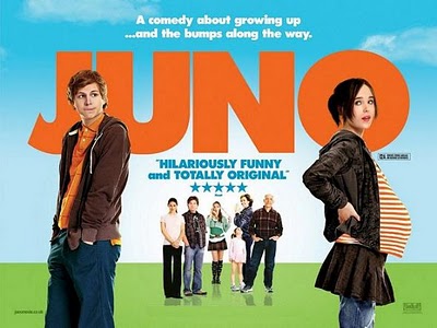
Juno
The first thing that strikes me is the colours that stand out and draw your eyes to the poster. They work well to create a fun/playful mood and the caption above the main title reinforces this as a playful film. This poster in particular, I believe is aimed at a younger teenage audience as they would be drawn in by the colours and light hearted text.
 The positioning of the characters shows the main 2 characters being shown clearly to the audience and the lesser characters in the background. This invites the audience to learn more about those characters in the background. The positioning of the main title also actually fits enough so that Juno's baby bump is parallel with the end of the title. The gap between the male character and the end of the title is there to show a contrast to how big her bump is, which shows importance within the movie.
The main male character has quite a timid body language and he looks uncomfortable and his hands in his pockets with the main female character portrays a confidence about herself. This poster works well to create an image of what the characters will be like in the movie through body language, costume and facial expressions.
The text used in the title works well as it contrasts well with the background and also fits in with the colour coding of the characters. The subtext fits with the background instead of contrasting works as it is pleasing to the eye. The age rating is almost hidden away in this as I believe they wanted to get a sense of empty space as they have left the left and right of the poster free of writing.
Brighton Rock
 We can tell from this poster that brighton rock is a thriller as we can tell from the dark, serious expressions and the clouds in the background show darkness. The fact that the clouds looks like they are coming toward the light could be implying a 'coming storm' and could imply two sides to the film. The angle of the picture is slightly canted which shows a sense of dissaray which could relate to themes within the film.
The title contrasts against the dark background as well as the reviews, similar movies and studioblock. They are mostly concentrated over the dark part of the poster as I think they may have wanted them to stand out. The functional title is in a similar block capital and I believe they chose this just to simply stand out. I thought that it seemed to impose from the poster and catches your eyes straight away and this must be the desired effect.
Brighton pier in the background is portrayed in this poster as quite a menacing structure. It almost makes it looks like a prison to me and looks sinister. Being on the dark side of the poster, the pier is made more imposing as the light shows up against the cloud. Brighton pier being a landmark sign of Brighton it shows that this film could portray a darker side to Brighton than the viewer may be used to.
The characters also draw the eye as they all have interesting facial expressions. Helen Mirram's character looks concerned and had a serious expression which shows she may be under threat within the movie. The male character looks menacing and certain techniques are used within the poster to portray this toward us; for instance he has a shadow on his face, is dressed in an imposing suit and he looks straight toward the viewer of the poster which adds a personal touch, the viewer may feel threatened. The fact that the women are standing behind the man and he looks considerably larger than them, could show a traditional representation of women at the time the film was set (40s).
We can tell straight away that this film would not be for audiences under 15, even without looking at the age rating. The dark nature of the poster with serious facial expressions would immediately turn off a younger audience as it is immediately made clear it is a serious film. Helen Mirram's presence in the poster shows us that it must be an upclass film as she seems to select her movies carefully.
City of god
City of god is a film about 2 kids growing up in the brazilian slums of Rio de Janeiro as they both follow 2 different paths. I chose this poster as it is quite a low budget movie like ours and I believe the poster shows a lot about the movie just from looking at it.
 The two images show us what the main themes of the story are: romance and violence. These are both portrayed in a different sense for instance the top image shows a picturesque scene, shows happiness and also has a sense of warmth around it. The light reflecting off of the characters gives this warm tanned feeling and gives us a sense of freedom and being young. The lower image portrays a different view of the movie; the haziness of the image gives me a sense of being too hot. This could imply the frenziness of the situation and the way that everyone is pointing their 'guns' toward the viewer of the poster could be intimidating and may interest them.
This poster seems to keep with it's running theme throughout the poster as the main title font and the review at the top of the poster are almost identical. The font is also shown in the tag line instead it is white instead of a yellow colour; Ibelieve it is white to stand out against the black background, the fact it is also in the center puts more attention on it.
The main characters are not immediately obvious as they aren't facing the viewer so it could imply that it is more of a movie concentrating on the slum gangs rather than main characters. It could also be a technique to make the viewer want to see the movie to learn more about the character as you don't see much of them.
The rough look around the pictures may show that the film could show rough elements and implies poverty as it gives us an idea that the poster is crudely done. The rough font that the title and other sub text is in reinforces this idea as it looks very raw and messy.
I think this film would be aimed toward a plus 15 target audience as it clearly shows aspects of poverty and living in desperation through the poster. It shows quite dull colours which would not attract attention from a child but would most likely interest an adult as they would want to learn about the sepia feel to the poster.
This is England
This is England is a film by Shane Meadows about a young boy who goes into a group of skin heads and makes some wrong choices.
 From the poster, we can tell that this is England is a drama clearly set in England because of the title and the flats in the background are noticeably English. We can also tell it is a rough urban environment in which it is set as they are all leaning up against a metal wall in a back alley it looks like.
From this and they way they are dressed, like skin heads, we could get the idea they could be up to trouble. The characters are all facing toward the screen and this is quite imposing for the viewer. Their body language seems to be quite mixed with some people very relaxed, people looking angry and people looking malicious and this shows that they have a mixed group of friends. We cannot tell who the main characters are as they are all lined up equally and I think this is because the poster is meant to give the idea that it is one big gang.
The different colours in the title could be there to stand out as the tag line is about standing out from the crowd. There are also the colours of the english st georges flag and the union jack which gives it a distinct British feel and could give the impression it is quite a patriotic film. Because the title looks rough and chipped away it could give an impression it is reflecting the lower class side of England, representing a poor community. Other text such as the review and who the film was by is done in a way that looks like it's a pen drawing and make's it look like graffiti which reinforces this aspect of a lower class representation.
The colours of the poster seem to mainly revolve around blue which is considered a calm colour so the poster could be implying they are quite a friendly group unlike the poster suggests. The dark blue 'ENGLAND' in the title and the 'winner best film' work well to stand out from the much lighter sky blue and reinforce this them of blue in the poster. The spacing of the poster works well as it used rule of thirds to produce a poster that is pleasing to the eye; the use of a large space above the main focus of picture works well as the title and other subtext could be placed there and look good.
We can also tell this film is not going to portray traditional representations of women as the women are dressed in quite a boyish way and look like they stand from the ground. This could be a contemporary representation as they seem to have strong and confident body language which helps us create the idea that they could have a hard personality. The main thing this poster is showing is that the small boy has joined their group as he is noticeably shorter than them, this allows us to concentrate on him. This raises some enigma codes about the film and could encourage someone to go and see it.
The first thing that strikes me is the colours that stand out and draw your eyes to the poster. They work well to create a fun/playful mood and the caption above the main title reinforces this as a playful film. This poster in particular, I believe is aimed at a younger teenage audience as they would be drawn in by the colours and light hearted text.
 The positioning of the characters shows the main 2 characters being shown clearly to the audience and the lesser characters in the background. This invites the audience to learn more about those characters in the background. The positioning of the main title also actually fits enough so that Juno's baby bump is parallel with the end of the title. The gap between the male character and the end of the title is there to show a contrast to how big her bump is, which shows importance within the movie.
 The main male character has quite a timid body language and he looks uncomfortable and his hands in his pockets with the main female character portrays a confidence about herself. This poster works well to create an image of what the characters will be like in the movie through body language, costume and facial expressions.
The text used in the title works well as it contrasts well with the background and also fits in with the colour coding of the characters. The subtext fits with the background instead of contrasting works as it is pleasing to the eye. The age rating is almost hidden away in this as I believe they wanted to get a sense of empty space as they have left the left and right of the poster free of writing.
Brighton Rock

The title contrasts against the dark background as well as the reviews, similar movies and studioblock. They are mostly concentrated over the dark part of the poster as I think they may have wanted them to stand out. The functional title is in a similar block capital and I believe they chose this just to simply stand out. I thought that it seemed to impose from the poster and catches your eyes straight away and this must be the desired effect.
Brighton pier in the background is portrayed in this poster as quite a menacing structure. It almost makes it looks like a prison to me and looks sinister. Being on the dark side of the poster, the pier is made more imposing as the light shows up against the cloud. Brighton pier being a landmark sign of Brighton it shows that this film could portray a darker side to Brighton than the viewer may be used to.
The characters also draw the eye as they all have interesting facial expressions. Helen Mirram's character looks concerned and had a serious expression which shows she may be under threat within the movie. The male character looks menacing and certain techniques are used within the poster to portray this toward us; for instance he has a shadow on his face, is dressed in an imposing suit and he looks straight toward the viewer of the poster which adds a personal touch, the viewer may feel threatened. The fact that the women are standing behind the man and he looks considerably larger than them, could show a traditional representation of women at the time the film was set (40s).
We can tell straight away that this film would not be for audiences under 15, even without looking at the age rating. The dark nature of the poster with serious facial expressions would immediately turn off a younger audience as it is immediately made clear it is a serious film. Helen Mirram's presence in the poster shows us that it must be an upclass film as she seems to select her movies carefully.
City of god
City of god is a film about 2 kids growing up in the brazilian slums of Rio de Janeiro as they both follow 2 different paths. I chose this poster as it is quite a low budget movie like ours and I believe the poster shows a lot about the movie just from looking at it.

This poster seems to keep with it's running theme throughout the poster as the main title font and the review at the top of the poster are almost identical. The font is also shown in the tag line instead it is white instead of a yellow colour; Ibelieve it is white to stand out against the black background, the fact it is also in the center puts more attention on it.
The main characters are not immediately obvious as they aren't facing the viewer so it could imply that it is more of a movie concentrating on the slum gangs rather than main characters. It could also be a technique to make the viewer want to see the movie to learn more about the character as you don't see much of them.
The rough look around the pictures may show that the film could show rough elements and implies poverty as it gives us an idea that the poster is crudely done. The rough font that the title and other sub text is in reinforces this idea as it looks very raw and messy.
I think this film would be aimed toward a plus 15 target audience as it clearly shows aspects of poverty and living in desperation through the poster. It shows quite dull colours which would not attract attention from a child but would most likely interest an adult as they would want to learn about the sepia feel to the poster.
This is England
This is England is a film by Shane Meadows about a young boy who goes into a group of skin heads and makes some wrong choices.

From this and they way they are dressed, like skin heads, we could get the idea they could be up to trouble. The characters are all facing toward the screen and this is quite imposing for the viewer. Their body language seems to be quite mixed with some people very relaxed, people looking angry and people looking malicious and this shows that they have a mixed group of friends. We cannot tell who the main characters are as they are all lined up equally and I think this is because the poster is meant to give the idea that it is one big gang.
The different colours in the title could be there to stand out as the tag line is about standing out from the crowd. There are also the colours of the english st georges flag and the union jack which gives it a distinct British feel and could give the impression it is quite a patriotic film. Because the title looks rough and chipped away it could give an impression it is reflecting the lower class side of England, representing a poor community. Other text such as the review and who the film was by is done in a way that looks like it's a pen drawing and make's it look like graffiti which reinforces this aspect of a lower class representation.
The colours of the poster seem to mainly revolve around blue which is considered a calm colour so the poster could be implying they are quite a friendly group unlike the poster suggests. The dark blue 'ENGLAND' in the title and the 'winner best film' work well to stand out from the much lighter sky blue and reinforce this them of blue in the poster. The spacing of the poster works well as it used rule of thirds to produce a poster that is pleasing to the eye; the use of a large space above the main focus of picture works well as the title and other subtext could be placed there and look good.
We can also tell this film is not going to portray traditional representations of women as the women are dressed in quite a boyish way and look like they stand from the ground. This could be a contemporary representation as they seem to have strong and confident body language which helps us create the idea that they could have a hard personality. The main thing this poster is showing is that the small boy has joined their group as he is noticeably shorter than them, this allows us to concentrate on him. This raises some enigma codes about the film and could encourage someone to go and see it.
Poster Idea - EVE. ''Forgetting Jim''

For my poster idea, I think we should have a close up of the fish bowl that is in focus on the left hand side of
the frame, then have an out of fous image behind (in the background) of the sofa and our two main characters 'Scott' and 'Laura' sitting on the sofa behind. The writing will not appear exactly like this, it will be slightly smaller and be in a simple font that will (like the posters I have been researching) conrast the colours
behind it as I think the has worked really well and been successful in my own poster reaserch.
Film poster analysis - Eve
Juno
For this section of our blog, we are now moving on to researching and making our posters, taking the onefrom the film 'Juno' a comedy-drama made in 2007 featuring Ellen Page as a pregnant teenager and having to struggle through the hardships of being a teen mum.


I really liked this poster, it contained the comedy element and fun feature of the film in the colour of the text and background image which made this poster stand out a lot better amongst others. The clashing of the colours
The only different coloured text is that with the age certification of the film which is in black, and a sponsor which is in the bottom right hand corner of the poster. This makes them stand out however; not overtake and distract from the title and other aspects of type of the poster which has been cleverly achieved.
The framing on this film poster is key to the audience knowing the context, themes and storyline of the film. In a few seconds people will make a decision about whether they will see the film or not, therefore the poster must be descriptive yet simple and create an idea of the content in the audience's mind. The framing of this poster is so important because of 'Juno's' bump, the striped t-shirt makes the pregnancy more obvious and allows people to start having an idea on whether they want to see the film and what the main themes are in the film. It also allows us to see the body language and posture which tells us a lot about the actors and actresses characters which are being portrayed in the film.
Juno, played by Ellen Page is portrayed in this image as being confident, comfortable in her position and quirky; having seen the film I know this image shows her in a way that coincides with how she is portrayed in the film. However, Paulie who plays her boyfriend during the first part of the film is shown as a slightly geeky, awkward and innocent teenager who
The lighting of this poster is bright, implying the film is light hearted and made for a specific teenage/older teen audience however; other age groups would find the film entertaining and fun. Having other characters bright and in focus however, not as included in the film behind the two main characters adds to the feeling of the poster, implying that the story isn't just about Juno but about much more than one person. It also has a slight meaning behind it, saying that the pregnancy will effect everyone around Juno, not just her and her boyfriend.
Clothing and make up are kept to a minimum and work well in this way I think, it makes the two actors seem and appear to be innocent and less imposing; It also makes the pregnancy seem as a complete contrast because of the two actors being so young.
Brighton Rock

The next film poster that I will be analysing is Brighton Rock, a remake of the book by Graham Greene published in the 1930's. However, the film has been moved forward andset in 1964 during the Mods and Rockers era.
Starting by looking at the colour of the background and how it effects the mood of the poster, I think it makes the film seem more dark, it allows more questions to be asked about the themes that occur in the film and this makes the audience looking at the poster more curious as to the content. The background image of the pier exaggerates the idea of it being set in Brighton, however; a lot of the film has actually been filmed in Eastbourne.
Because of the background being such a strong colour, the text appears much more imposing however; not over the top. It works well as it contrasts the black background behind making the title and reviews stand out well.
The framing of the poster has been cleverly and differently done, looking first at the cantered shot as the pier seems to be at an angle rather than following the line of the poster's sides makes the image quirky and different. In my own opionion I think this makes it much more appealing as it has not been done in a conventional way and to the audience it is aimed at (twenty five years and over) I think this will also appeal to them.
The framing also allows the audience to see the three actors costumes, showing us that it is not set in a modern setting and that actually it is slightly older, maybe the 1960/70's. It also makes us think about some of the issues and themes that may occur in this film, who the actors/characters are, are they related or is this some kind of love triangle as they appear to be standing in that way. Another aspect of costume that is slightly interesting is that the female on the right has her coat unbuttoned however, the second female on the left has her coat done up, this may imply something about their characters personality.
This framing and time setting also allows us to think back to traditional roles that males and females had during those times. The female on the right seems to be standing just behind the male, appearing as being less powerful and less confident however; her body language and expression say much more and it appears she is glaring at the female on the left side of the poster. The idea of traditional roles is emphasised here as well as the second female apears to be anxious, worried and frighted because of her body language and posture and her facial expression.The appearance and expression on the males face however, contrasts that of the female on the left he appears strong, assertive and confident, he also appears to be daunting and angry. This enhances the idea of traditional roles and what part they will play during this film, will this lead to a main theme in the film? Or will it be an insignificant part of the film?
Looking more closely at the text and type used in this poster, I think it has been used in a very effective and successful way; it is simple, clean cut and not fussy which would have distracted the audeinces view from the main image of the characters. I liked in this poster, the way that the sponsers have included their opinions at the top and the choice of text colour makes them stand out a lot better than other posters I have seen; however, it does not take the viewer's eye away immediately from the image and film title.
Letters To Juliet

The next film poster I will be looking at is Letters To Juliet, a film starring Amander Seyfried and Christopher Egan; I have decided for my final two posters that I wanted to get agreat contrast in the context and themes of the films and show how this affects the poster.
I have decided this film because of the bright and appealing poster and also because of the difference in text and type that appear on this poster. Looking firstly at the text, I like it because it was simple, the colours clashed with the blue sky in the background and I think this made it more appealing to the audience; it makes the text stand out well however does not distract from the images and background objects.
I really liked the way the text and the two main characters heads all ran along the same line at the top of the poster, it made it much more simple and makes it appear not too fussy and keeps it simple. The red is carried through to the sponsers comments in the bottom left hand corner of the poster, and like Brighton Rock; the producers of the poster have chosen to include star ratings that may appeal to their audience more.
The audience this film is aimed at ranges, it is a PG therefore goes from a young age group up to an older age group for example grandparents and up would enjoy this film. It is light hearted and has commical aspects to it which are reflected back in the poster.
The bright and light hearted feeling is also conveyed in the colouring of the clothing they are wearing, neither of the two main characters are wearing dark coloured clothing and neither are the two characters in the background. This is a contrast from the previous film Brighton Rock where all characters were wearing dark clothing, this shows that the two films themes are very differet and this allows the audience to see which fillms are tailered for them.
The framing of this poster is similar to that of Brighton Rock as it allows the audience to see sections of the background, giving an idication of the setting; also it allows the viewers to see the clothing which gives them and idea of the time setting, whether it is 1900's/older or newer. From the images on the poster, we can see that it is a modern setting. The framing of the poster also allows us to see the body language and facial expressions of the characters, the two main characters in the foreground appear to be confident and comfortable with the situation they are in; the male seems to have his head and eyes pointing/looking at the female giving us a slight indication of the time setting as this appears to be going against the traditional ideas of masculinity and feminity.
The last aspect of this film poster that I will be looking at is the background, the images that have been put together to create an inviting and inticing feel about the poster. I liked the way the producers have playing with the depth of field here and used images of Verona (Italy) to set the themes and ideas in the viewers mind. I liked the use of bright colours that they have used as it makes the image more appealing and contrasts well against the blue colouring of the sky. I feel the only problem with the background image is that the two people who are amoungst the sunflowers seem to be slightly hidden and not made obvious that they are there, if I were making this poster I would of made them wear slightly different coloured clothes or changed the yellow of the sunflowers to make them stand out a little more.
However, I think this poster is very well presented; it has many sucessfull aspects to it which have completed the poster and made it very attractive and informative to it's target audience.
The Dark Knight
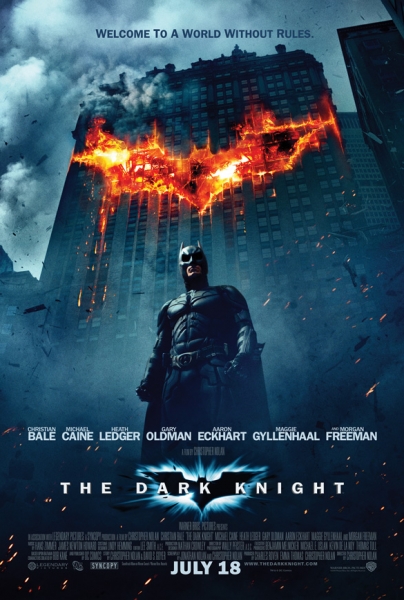
The final film poster I will be looking at is Christopher Nolan's 'The Dark Knight' a complete contrast in both looks and themes wise compared to Letters To Juliet. I chose this because of the dark, mysterious and eerie feeling to the poster; which is a compelte contrast to the light hearted, easy going feeling of the previous one.
Starting again with the text/titiling that is included in this poster, it is fairly similiar to that of Brighton Rock's with the simple straight lines and bold white colouring which stands out against the harsh black and greay background image and colouring. This poster is slightly different as it has a lot more writing and credits along the bottom of the poster and also includes the realease date whereas none of my previous posters have done this.
The poster (like Letters to Juliet and Brighton Rock) includes names of the main actors in the film which match the text type that has been used for the title, I think this links this section of writing well and allows the image in the background to stand out and not be distracted from.
The background itself is very different to that of Letters to Juliet, it's dark colours and mixture of action with the shards of wood/rubble flying behind the character gives it a sense of frozen action which most viewers will find inticing and interesting, wanting to know what happens and the series of events that has lead up to this shot. Different from Letters to Juliet, the Batman poster only has one of the main characters on the front; this I think in a way is very clever, implying that he is always there whereas 'The Joker' who is constantly dissapearing emphasises this in the poster. The large block of orange colour at the top of the poster that represents Batman's logo/symbol makes the poster much more attractive, it engages people and give the element of mystery about it which I think the audience really liked. It also gives the audience an idea of who is most powerful in this film, who will hold authority and who will win any battles or disputes that may occur; it implies that nobody is stronger than Batman and again is giving more clues as to the themes, issues and context of the film.
The framing of the poster is clever, it allows us to see the majority of the building that appears to be involved in an explosion, yet the low angle shot also allows us to see most of batman, see his clothing and disguise that allows him to become the Batman. This, unlike Letters to Juliet is reinforcing female and male roles in the film, assuming that the male is the stronger, more powerful and more violent individual. He is portrayed in this way in the poster because of his clothing and the scene behind him, that of explosions and what appears to be distruction. This will appeal to the majority of people who see the poster, they are looking for an action movie and the poster tells them that it is exactly that.
Unlike Brighton Rock and Letters to Juliet, The Dark Knight and Juno both have tag lines at the top of their posters, giving indications of the films themes and issues, what may occur and what the viewers and audience can expect. I think the one for The Dark Knight has been cleverly done as it is in a slightly darker shade of grey compared to the sky which makes it stand out however it is not extremely obvious.
Subscribe to:
Comments (Atom)