Juno
For this section of our blog, we are now moving on to researching and making our posters, taking the onefrom the film 'Juno' a comedy-drama made in 2007 featuring Ellen Page as a pregnant teenager and having to struggle through the hardships of being a teen mum.


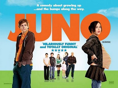
I really liked this poster, it contained the comedy element and fun feature of the film in the colour of the text and background image which made this poster stand out a lot better amongst others. The clashing of the colours
The only different coloured text is that with the age certification of the film which is in black, and a sponsor which is in the bottom right hand corner of the poster. This makes them stand out however; not overtake and distract from the title and other aspects of type of the poster which has been cleverly achieved.
The framing on this film poster is key to the audience knowing the context, themes and storyline of the film. In a few seconds people will make a decision about whether they will see the film or not, therefore the poster must be descriptive yet simple and create an idea of the content in the audience's mind. The framing of this poster is so important because of 'Juno's' bump, the striped t-shirt makes the pregnancy more obvious and allows people to start having an idea on whether they want to see the film and what the main themes are in the film. It also allows us to see the body language and posture which tells us a lot about the actors and actresses characters which are being portrayed in the film.
Juno, played by Ellen Page is portrayed in this image as being confident, comfortable in her position and quirky; having seen the film I know this image shows her in a way that coincides with how she is portrayed in the film. However, Paulie who plays her boyfriend during the first part of the film is shown as a slightly geeky, awkward and innocent teenager who
The lighting of this poster is bright, implying the film is light hearted and made for a specific teenage/older teen audience however; other age groups would find the film entertaining and fun. Having other characters bright and in focus however, not as included in the film behind the two main characters adds to the feeling of the poster, implying that the story isn't just about Juno but about much more than one person. It also has a slight meaning behind it, saying that the pregnancy will effect everyone around Juno, not just her and her boyfriend.
Clothing and make up are kept to a minimum and work well in this way I think, it makes the two actors seem and appear to be innocent and less imposing; It also makes the pregnancy seem as a complete contrast because of the two actors being so young.
Brighton Rock

The next film poster that I will be analysing is Brighton Rock, a remake of the book by Graham Greene published in the 1930's. However, the film has been moved forward andset in 1964 during the Mods and Rockers era.
Starting by looking at the colour of the background and how it effects the mood of the poster, I think it makes the film seem more dark, it allows more questions to be asked about the themes that occur in the film and this makes the audience looking at the poster more curious as to the content. The background image of the pier exaggerates the idea of it being set in Brighton, however; a lot of the film has actually been filmed in Eastbourne.
Because of the background being such a strong colour, the text appears much more imposing however; not over the top. It works well as it contrasts the black background behind making the title and reviews stand out well.
The framing of the poster has been cleverly and differently done, looking first at the cantered shot as the pier seems to be at an angle rather than following the line of the poster's sides makes the image quirky and different. In my own opionion I think this makes it much more appealing as it has not been done in a conventional way and to the audience it is aimed at (twenty five years and over) I think this will also appeal to them.
The framing also allows the audience to see the three actors costumes, showing us that it is not set in a modern setting and that actually it is slightly older, maybe the 1960/70's. It also makes us think about some of the issues and themes that may occur in this film, who the actors/characters are, are they related or is this some kind of love triangle as they appear to be standing in that way. Another aspect of costume that is slightly interesting is that the female on the right has her coat unbuttoned however, the second female on the left has her coat done up, this may imply something about their characters personality.
This framing and time setting also allows us to think back to traditional roles that males and females had during those times. The female on the right seems to be standing just behind the male, appearing as being less powerful and less confident however; her body language and expression say much more and it appears she is glaring at the female on the left side of the poster. The idea of traditional roles is emphasised here as well as the second female apears to be anxious, worried and frighted because of her body language and posture and her facial expression.The appearance and expression on the males face however, contrasts that of the female on the left he appears strong, assertive and confident, he also appears to be daunting and angry. This enhances the idea of traditional roles and what part they will play during this film, will this lead to a main theme in the film? Or will it be an insignificant part of the film?
Looking more closely at the text and type used in this poster, I think it has been used in a very effective and successful way; it is simple, clean cut and not fussy which would have distracted the audeinces view from the main image of the characters. I liked in this poster, the way that the sponsers have included their opinions at the top and the choice of text colour makes them stand out a lot better than other posters I have seen; however, it does not take the viewer's eye away immediately from the image and film title.
Letters To Juliet

The next film poster I will be looking at is Letters To Juliet, a film starring Amander Seyfried and Christopher Egan; I have decided for my final two posters that I wanted to get agreat contrast in the context and themes of the films and show how this affects the poster.
I have decided this film because of the bright and appealing poster and also because of the difference in text and type that appear on this poster. Looking firstly at the text, I like it because it was simple, the colours clashed with the blue sky in the background and I think this made it more appealing to the audience; it makes the text stand out well however does not distract from the images and background objects.
I really liked the way the text and the two main characters heads all ran along the same line at the top of the poster, it made it much more simple and makes it appear not too fussy and keeps it simple. The red is carried through to the sponsers comments in the bottom left hand corner of the poster, and like Brighton Rock; the producers of the poster have chosen to include star ratings that may appeal to their audience more.
The audience this film is aimed at ranges, it is a PG therefore goes from a young age group up to an older age group for example grandparents and up would enjoy this film. It is light hearted and has commical aspects to it which are reflected back in the poster.
The bright and light hearted feeling is also conveyed in the colouring of the clothing they are wearing, neither of the two main characters are wearing dark coloured clothing and neither are the two characters in the background. This is a contrast from the previous film Brighton Rock where all characters were wearing dark clothing, this shows that the two films themes are very differet and this allows the audience to see which fillms are tailered for them.
The framing of this poster is similar to that of Brighton Rock as it allows the audience to see sections of the background, giving an idication of the setting; also it allows the viewers to see the clothing which gives them and idea of the time setting, whether it is 1900's/older or newer. From the images on the poster, we can see that it is a modern setting. The framing of the poster also allows us to see the body language and facial expressions of the characters, the two main characters in the foreground appear to be confident and comfortable with the situation they are in; the male seems to have his head and eyes pointing/looking at the female giving us a slight indication of the time setting as this appears to be going against the traditional ideas of masculinity and feminity.
The last aspect of this film poster that I will be looking at is the background, the images that have been put together to create an inviting and inticing feel about the poster. I liked the way the producers have playing with the depth of field here and used images of Verona (Italy) to set the themes and ideas in the viewers mind. I liked the use of bright colours that they have used as it makes the image more appealing and contrasts well against the blue colouring of the sky. I feel the only problem with the background image is that the two people who are amoungst the sunflowers seem to be slightly hidden and not made obvious that they are there, if I were making this poster I would of made them wear slightly different coloured clothes or changed the yellow of the sunflowers to make them stand out a little more.
However, I think this poster is very well presented; it has many sucessfull aspects to it which have completed the poster and made it very attractive and informative to it's target audience.
The Dark Knight
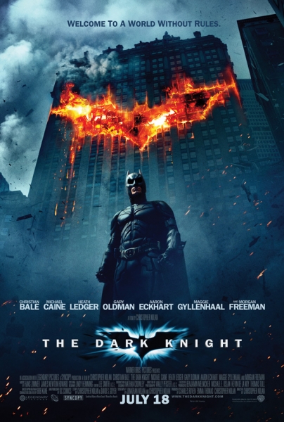
The final film poster I will be looking at is Christopher Nolan's 'The Dark Knight' a complete contrast in both looks and themes wise compared to Letters To Juliet. I chose this because of the dark, mysterious and eerie feeling to the poster; which is a compelte contrast to the light hearted, easy going feeling of the previous one.
Starting again with the text/titiling that is included in this poster, it is fairly similiar to that of Brighton Rock's with the simple straight lines and bold white colouring which stands out against the harsh black and greay background image and colouring. This poster is slightly different as it has a lot more writing and credits along the bottom of the poster and also includes the realease date whereas none of my previous posters have done this.
The poster (like Letters to Juliet and Brighton Rock) includes names of the main actors in the film which match the text type that has been used for the title, I think this links this section of writing well and allows the image in the background to stand out and not be distracted from.
The background itself is very different to that of Letters to Juliet, it's dark colours and mixture of action with the shards of wood/rubble flying behind the character gives it a sense of frozen action which most viewers will find inticing and interesting, wanting to know what happens and the series of events that has lead up to this shot. Different from Letters to Juliet, the Batman poster only has one of the main characters on the front; this I think in a way is very clever, implying that he is always there whereas 'The Joker' who is constantly dissapearing emphasises this in the poster. The large block of orange colour at the top of the poster that represents Batman's logo/symbol makes the poster much more attractive, it engages people and give the element of mystery about it which I think the audience really liked. It also gives the audience an idea of who is most powerful in this film, who will hold authority and who will win any battles or disputes that may occur; it implies that nobody is stronger than Batman and again is giving more clues as to the themes, issues and context of the film.
The framing of the poster is clever, it allows us to see the majority of the building that appears to be involved in an explosion, yet the low angle shot also allows us to see most of batman, see his clothing and disguise that allows him to become the Batman. This, unlike Letters to Juliet is reinforcing female and male roles in the film, assuming that the male is the stronger, more powerful and more violent individual. He is portrayed in this way in the poster because of his clothing and the scene behind him, that of explosions and what appears to be distruction. This will appeal to the majority of people who see the poster, they are looking for an action movie and the poster tells them that it is exactly that.
Unlike Brighton Rock and Letters to Juliet, The Dark Knight and Juno both have tag lines at the top of their posters, giving indications of the films themes and issues, what may occur and what the viewers and audience can expect. I think the one for The Dark Knight has been cleverly done as it is in a slightly darker shade of grey compared to the sky which makes it stand out however it is not extremely obvious.
Well done Eve can you get a draft poster design on the blog as well please
ReplyDeletea
I've done the draft poster, it's just above. I think you thought it was Adams.
ReplyDelete